̌
Hp INC. Innovation journal
The HP Brand Design team was tasked with updating and modernizing the aesthetic of the company's global, quarterly Innovation Journal to better align it with the company's mission of reinvention. The design team took a 180-degree approach to the journal by redesigning everything from the size of the journal itself to creating a new masthead, typography, iconography, page length, imagery, and overall layout design. Additionally, we expanded the journal from 24 pages to 100+ pages by dedicating full-page spreads to impactful images, adding billfolds, and die-cuts. Below is the concept design.
Creative Director: Ross Sutherland
Lead Designer: Christan Moy
Supporting Designers: Henry Cunningham and Michael Nguyen
Date of publication: Fall/Winter 2017
Above: A sample page of the Innovation Journal
Top to bottom, left to right: The cover (with new masthead) and Table of Contents as well as additional sample pages of the interior of the redesigned journal.
Click to flip through
A quick video of the published
Innovation Journal
HP INC. dIVERSITY AND INCLUSION ADS
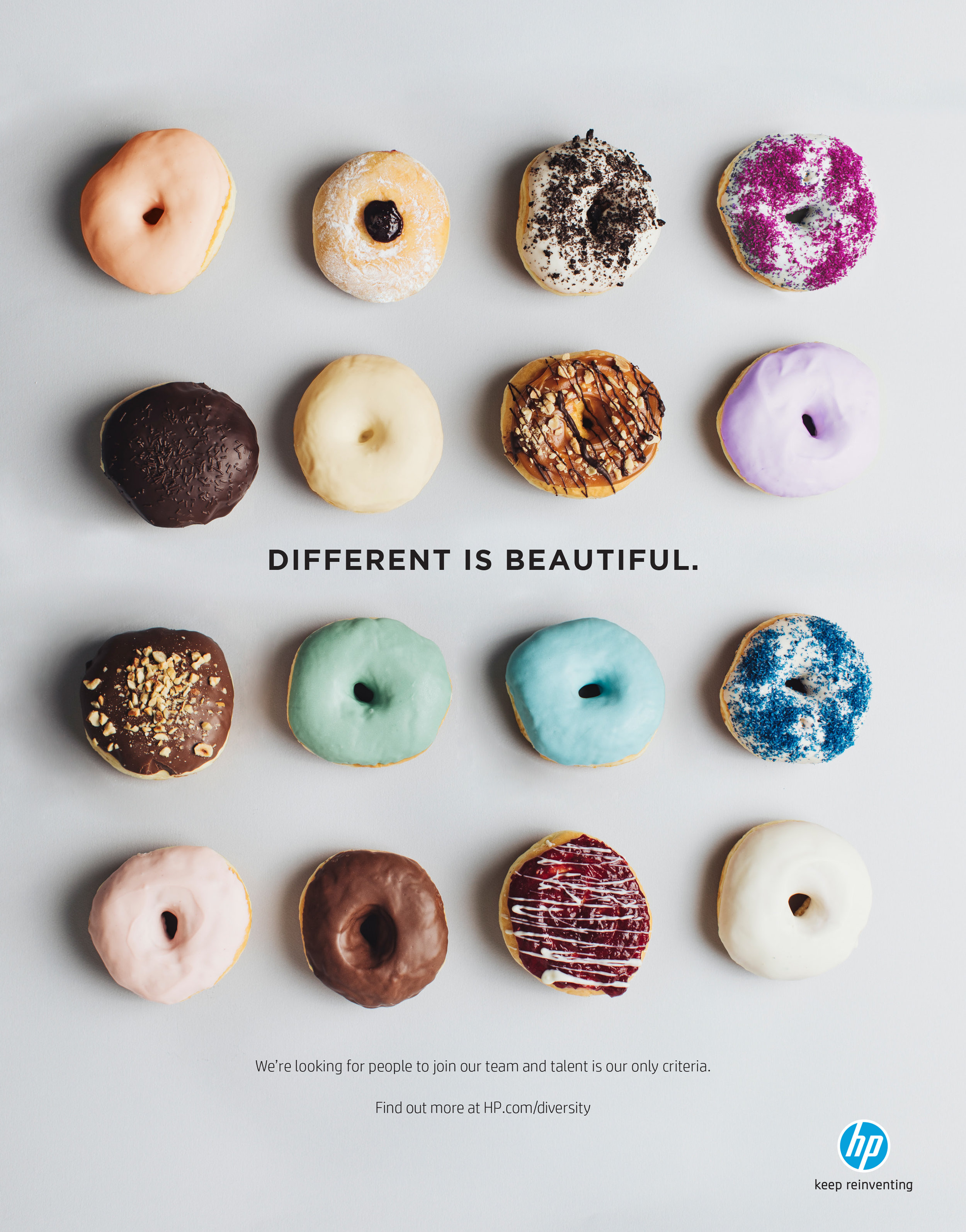
As part of the HP Inc. Diversity and Inclusion initiative, the Human Resources department was looking for new ways to entice potential hires with diverse backgrounds to apply to HP .
The ads below were published in various magazines and tech journals.
Lead Designer: Christan Moy
2015 SORAA LIGHTING PROduct guide
SORAA, a high-end lighting company, requested a quarterly product catalogue that would stand out from its competitors. The objectives were to develop a product guide that was not only informative in terms of the company's technology and products, but was also visually interesting and appealing in order to capture Soraa’s focus on high-quality lighting design.
I, with the direction of my Creative Director, re-designed the catalogue to look more like a lifestyle magazine. The new design included an all-white cover with a large embossment of the SORAA mark, vellum divider pages and photos of beautiful interiors of spaces using the lighting products.
This version won a Gold 2016 Stevie award for Best Marketing or Sales Brochure or Kit (print).
Creative Director: Ross Sutherland
Lead Designer: Christan Moy
Date of Publication : Spring 2015

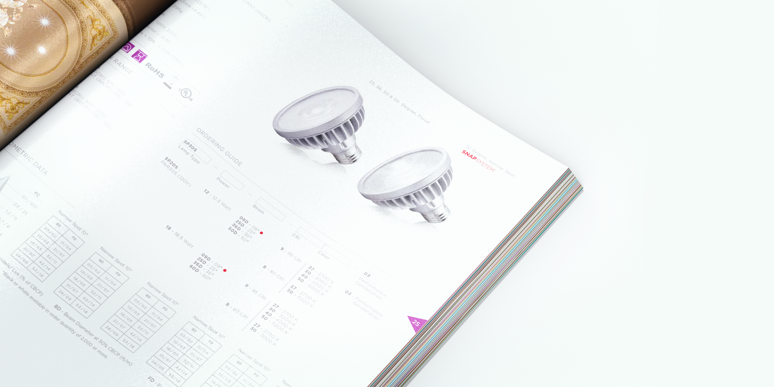
Above: A close-up shot of one of the product pages.
Below, left to right: The all-white cover with embossed logo and sample spreads of the catalogue.
The second spread below highlights how the vellum paper was used. The art illustration of the man (the president of the company) was printed onto semi-transparent paper so that his portrait could be partially seen underneath.
The STEVIE award, Gold Winner
From the STEVIE AWARD website: "The catalogue was distributed at the 2015 LIGHTFAIR, one of the top lighting conferences. Soraa’s feedback was that their customers were so impressed by the product guide that they asked for several copies and left Soraa with no copies at the end of the show. "
AVON Walk for breast cancer CAMPAIGN
Via an RFP, the AVON non-profit organization requested a new approach to engaging the public to sign up for their national breast cancer awareness events. Originally, the AVON campaigns featured hired models and lacked a genuine sense of emotion that the walks often evoke. After participating in the AVON walk in Washington, D.C., my colleagues and I realized that the new campaign should highlight actual participants to capture the range of emotions that the walks tend to rekindle (sadness, love, triumph). This concept was pitched to AVON and the agency won their business. The campaign was subsequently produced and printed in highly-trafficked areas including the NYC subway and train systems as well as in magazines and direct mail pieces.
Agency: Catapult Marketing
Art Directors: Christan Moy, Talia Bianco, Ani Eblighatian
Date of Publication: 2011
Above: A mock up of one of the posters that was produced and printed in many of the walking locations, including New York City transit.
Below, left: An ad created and published in various magazines featuring walkers at the finish line.
Below, middle and right: The interior and exterior of a direct mail piece. All creative for the campaign features photos taken of actual participants at one of the walking events across the country.
DANNON Yogurt Campaigns
We wanted to narrow in on this difference in calories because we knew it would matter to customers who were looking to consume fewer calories throughout the day. We created a campaign that addressed Yoplait's extra calories with a playful, yet direct, message.
Agency: Catapult Marketing
Art Directors: Christan Moy and Jena Newman
Below are examples of FSIs that were also created for Dannon's line of products.
EQUAL'S 30TH aNNIVERSARY cAMPAIGN
Merisant, the owner of Equal sugar products, wanted to celebrate their 30th anniversary through a campaign that would include everything from printed ads, in-store displays, limited-edition packaging (see packaging link for more) and contests. I, along with my Creative Director, designed a campaign that focused heavily on their iconic blue color as well as the various ways Equal products have been enjoyed throughout the years (coffee, baking, etc.) by thousands of customers.
Agency: Integrated Marketing
Creative Director: Jeff Odell
Art Director: Christan Moy
Date of Publication: 2014
Below, left and middle: An initial mock up of the campaign creative to pitch to Merisant. The final creative that was published in various magazines.
Below, right: An ad featuring a campaign contest with the singer, Jewel, for Pure Via, another product of Merisant's.
POST CEREALS Advertising Campaigns
Below are examples of ads that were created for various campaigns for Post cereal. The goal of all the campaigns was to highlight Post products as a healthy line of cereals that the entire family could feel good about eating.
Agency: Integrated Marketing
Creative Director: Ren Pia
Art Director: Christan Moy
reckitt benckiser ADVERTISING cAMPAIGNS
Below are examples of advertising campaigns for various Reckitt Benckiser products.
Agency: Integrated Marketing
Creative Director: Ren Pia
Art Director: Christan Moy
Below, left: A mock up of an ad concept for Clearasil that was meant address teenagers suffering from acne.
Below, middle and right: Sample creative for a Lysol campaign that would donate Lysol products to disaster zones throughout the world.


