Packaging
̌
Hp inc. inkjet PACKAGING
HP's print department was looking for a way to reinvent its packaging for a line of photo printers and ink products. The objective was to create an eye-capturing series of packaging that would stand out from competitors on shelves. Taking a minimalist approach, I designed packaging that focused mainly on the printers' benefits: Producing high-resolution, photo-quality prints for both the everyday consumer and small business owner. Below are examples of concepts I designed for various HP printer packages.
Designer: Christan Moy
Details: Concept designs for new HP printer packaging
Above and below: The two design approaches are both minimal in design.
One approach would wrap the packaging with bold imagery and uses the white holding shape to draw the eye to the main area of focus in the image.
Below: The second approach would take a singular object and place it against a bold solid color background, using a white holding shape to contain the information of the printer.
Both approaches highlight the benefit of the product, which is its ability to print high quality images on photo paper.
KETTLEBELL KICKBOXING fitness DVDs
When Dasha Libin, creator and owner of Kettlebell Kickboxing, started her business in 2011, she was just beginning to brand herself and needed a designer to work with her on creating a unique identity that she could own and trademark. Starting from scratch, I worked with her to create a look and feel for her brand, including a color palette, typography and photography that worked across web, promotional materials and packaging for her fitness programs. The packaging was produced and is sold on a variety of websites, including Amazon.com.
Client: Kettlebell Kickboxing
Designer and Art Director: Christan Moy
Below: A sample of DVD disc designs for the Kettlebell Kickboxing 7-Day lean series. The product also included a designed fitness manual and nutrition guide.
Below: A sample of DVD packaging for a series Kettlebell Kickboxing fitness videos
KELLOGG'S limited edition packaging
Kellogg's objective was to get more visibility during the holiday season when many companies would be vying for the best location on shelves. Working with the Creative Director, we came up with whimsical and fun illustrations that would wrap around the entirety of the box while not losing any of the required content (nutritional information, ingredients list, etc.). Although the client was apprehensive to get rid of its iconic red color, they ultimately approved the second iteration of the box below. This limited edition packaging was printed and sold exclusively at Target stores across the country. The design was also used on their Club Crackers packaging as well as their Mother's Cookies product line.
Agency: Catapult Marketing
Creative Director: Jeff Odell
Art Director: Christan Moy
Date of Distribution: Winter 2010
FERRERO ROCHER HOLIDAY DISPLAYS
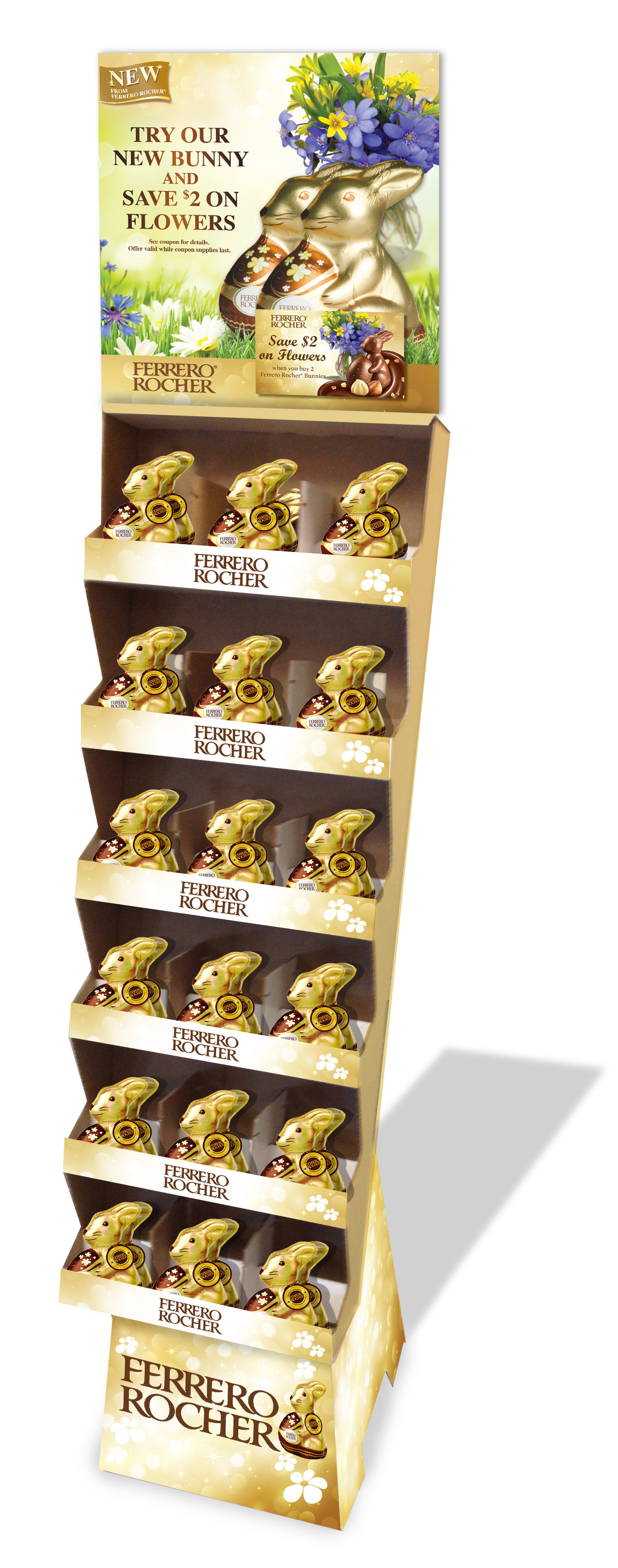
Ferrero Rocher wanted custom-designed, in-store displays for the holiday season in order to stand out from a variety of chocolate competitors. The Creative Director and I came up with concepts for photography that featured the iconic chocolate front and center at various holiday occasions. We art directed the photoshoot and created displays and copy that would leverage their vibrant gold packaging. The displays were produced and placed in various chain retail stores including CVS, Walgreens and others during the holiday season.
Agency: Integrated Marketing
Creative Director: Jeff Odell
Art Director: Christan Moy
Date of Distribution: 2014
Above and below, left: Holiday displays for Ferrero Rocher products using custom photography that was shot for their winter holiday campaign.
Below, right: A holiday display that was designed for their Easter campaign.
MERISANT Project name
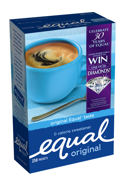
As part of Equal's 30th anniversary celebration, Merisant wanted to create custom packaging that would include their campaign contest, an opportunity to win one of 30 diamonds. The Creative Director and I designed the packaging below, which included a bold call-out of the contest on the front, as well as a design in the back that aligned with the other campaign assets (see more in the PRINT section), but also played up the contest award by replacing the overhead shot of coffee with a giant diamond.
Agency: Integrated Marketing
Creative Director: Jeff Odell
Art Director: Christan Moy
Date of Publication: 2014


